Category
- KIM Projects
- Projects
If you’re an architect or even just someone who keeps up with architectural designs, it’s very likely that you’ve heard of or seen a Moshe Safdie design or two. After all, Safdie is an influential architect who has produced a number of iconic designs throughout the world, such as Habitat 67 and the Jewel Changi Airport. He’s even earned a number of awards, including a position in the Order of Canada, a gold medal from the American Institute of Architects, and the Lynn S. Beedle Lifetime Achievement Award.
It’s something that those of us at Kryton think fondly of as we’ve seen his talent during some projects that we’ve helped to protect from water ingress. One of the more internationally recognized ones would be the Marina Bay Sands resort. (For more details, don’t hesitate to take a peek at our case study!)
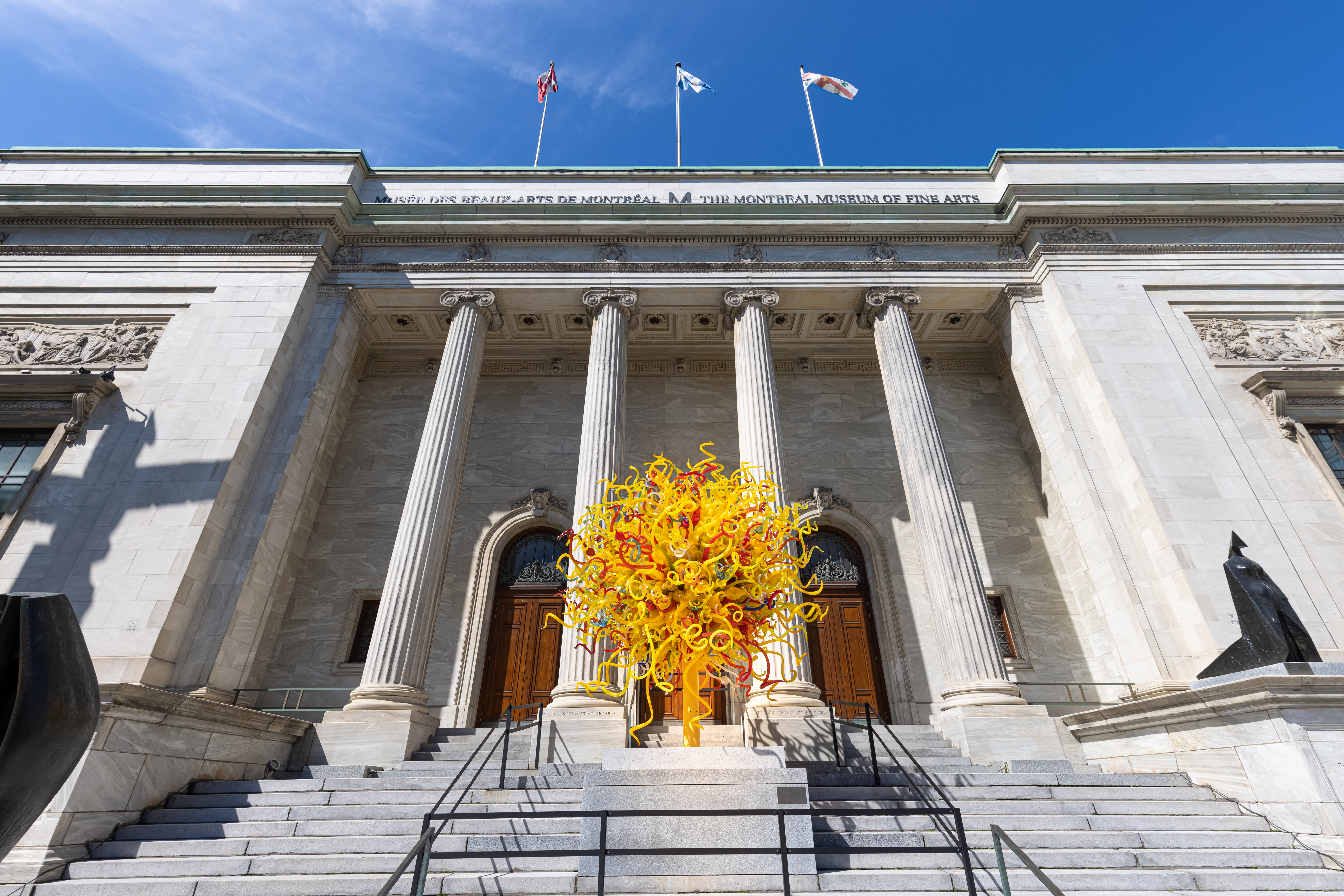
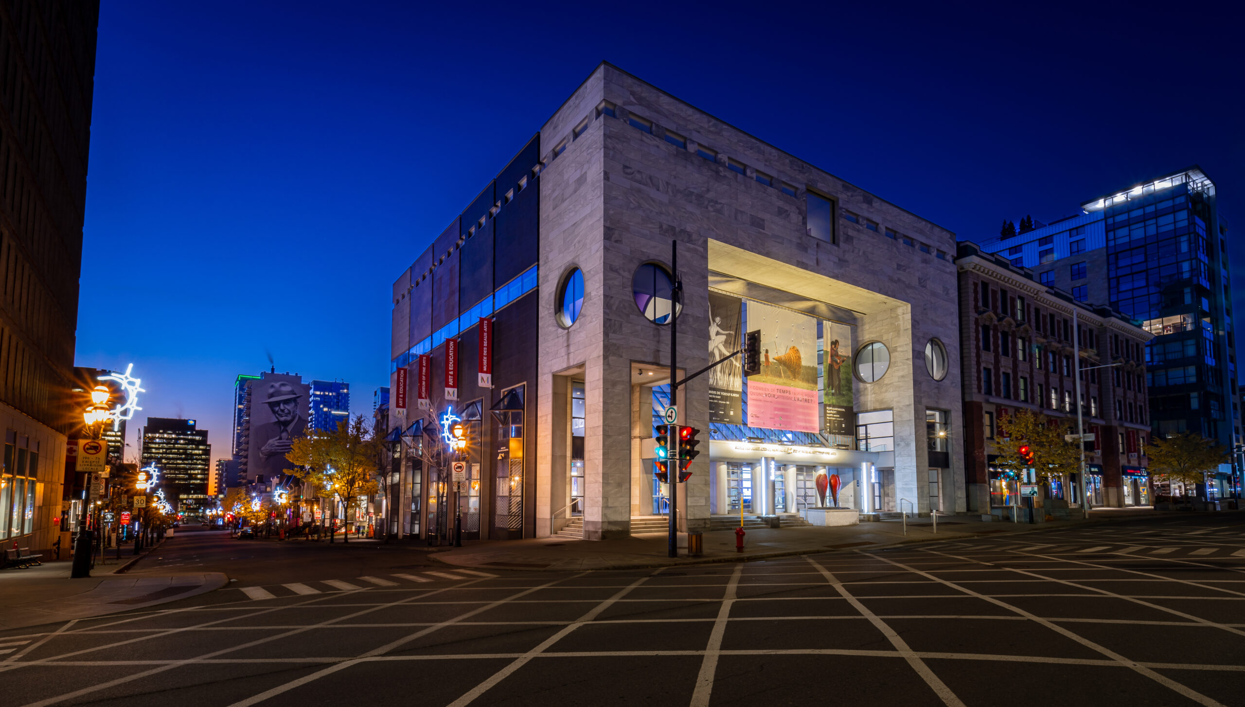
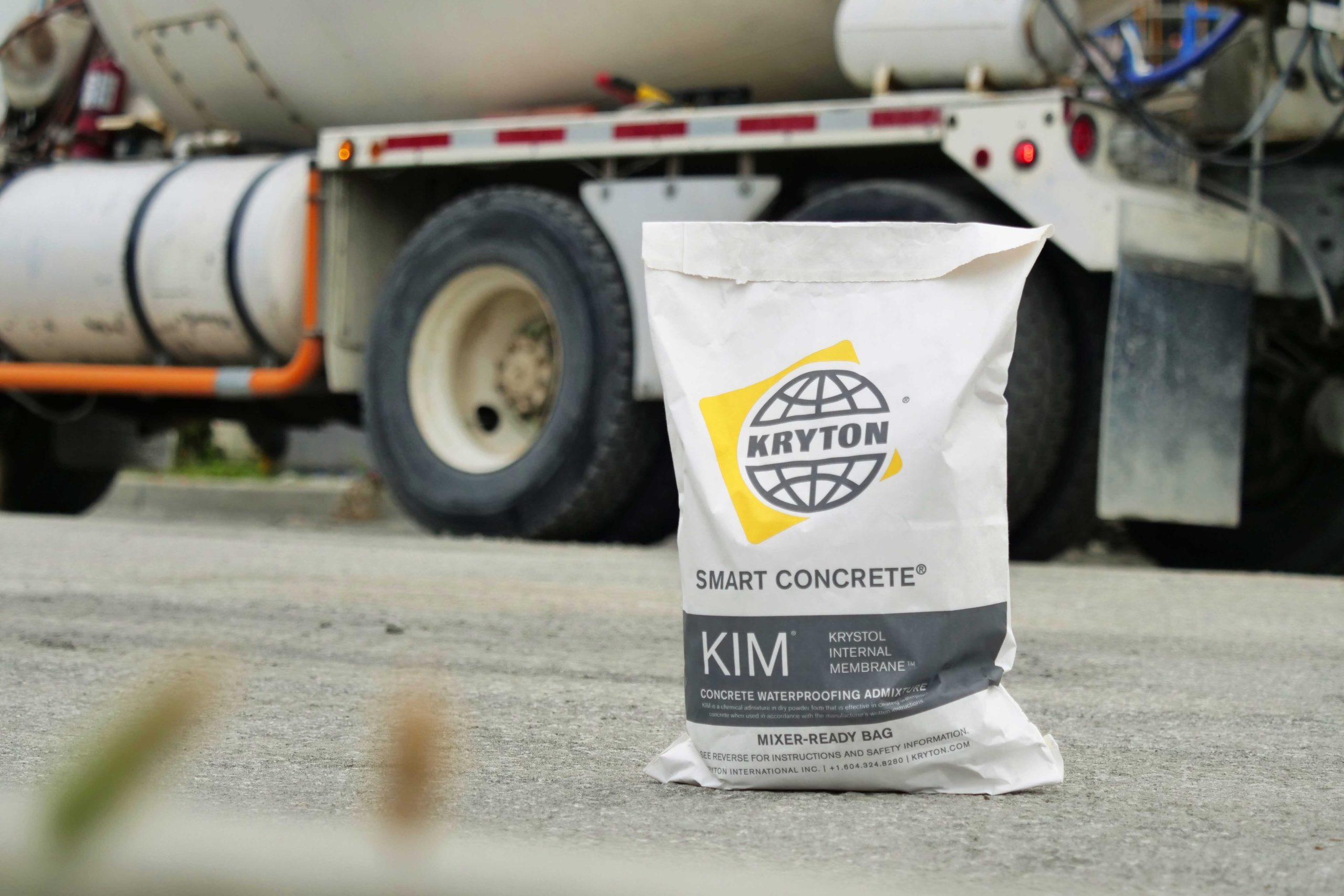
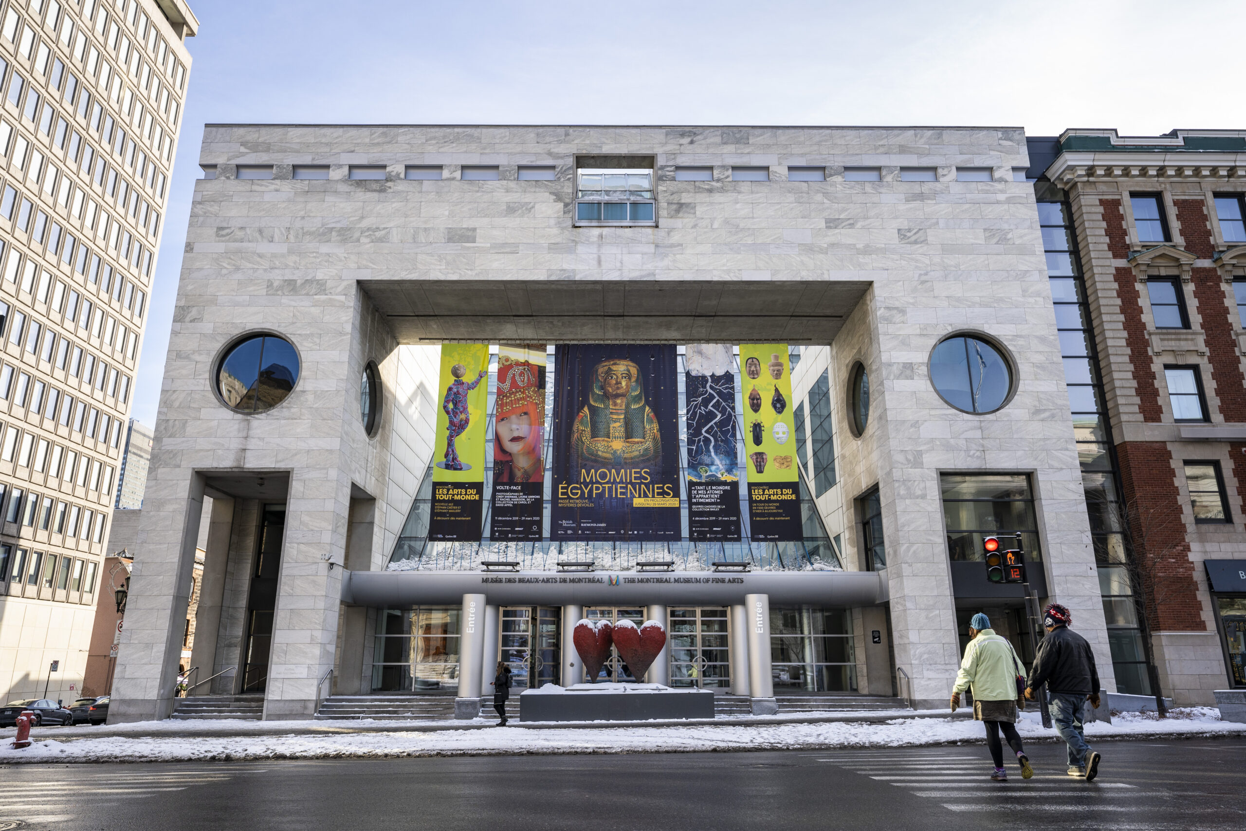
But our first one would be the 1991 expansion for the Montreal Museum of Fine Arts (also known as the Musée des beaux-arts de Montreal in French). Back then, concrete waterproofing admixtures were not yet a well-known option. But the museum and Safdie were willing to take a chance on our very own Krystol Internal Membrane™ (KIM®). To find out why and see just what KIM had to offer this prestigious project, let’s look back at the history of what is now known as the Montreal Museum of Fine Arts’ third expansion or the Jean-Noël Desmarais Pavilion.
It’s a Project That Had an Ambitious but Rocky Start
While the museum was no stranger to expansions, the third one proved to be a little trickier to pull off.
However, initially in 1986, that didn’t seem to be the case. Instead, at that time, the museum’s board of directors chair, Bernard Lamarre, was eagerly attempting to persuade his fellow board member Paul Desmarais to help back the project. It was not a difficult task. Desmarais loved big architectural projects after all. And that was exactly what this expansion was turning out to be.
Expected to more than double the size of the existing museum at the time, this project would take over the south side of Sherbrooke Street, covering 22,419 m2 (241,320 ft2). The museum had already purchased property on that street. All they had to do was demolish a 1905 brick apartment house that was in the area. The extra space that this would create for an addition to the museum was one that Lamarre believed would help give the museum international influence.
Desmarais was on board with this idea, but its execution left a number of stakeholders concerned. The biggest reason for that was simply the demolition of the existing building on the street. While it was not an important landmark, its old architecture formed an integral part of the city’s visual background. Many wanted to preserve its design, and after multiple public hearings, their desire prevailed.
But Once Approved, the Resulting Moshe Safdie Design Would Be Eye-Catching
The initial plan for the Montreal Museum of Fine Arts’ third expansion might have changed. But that did not make its end goal any less visually appealing.
Instead of starting from scratch, like Safdie and the museum’s director preferred, Safdie took up the challenge of preserving the design of the 1900s Sherbrooke building. The resulting vision would lead to the project retaining two 130-foot-long, 65-foot-high (40-meter-long, 20-meter-high) façade walls from the existing structure. These would remain on one side of the street while the rest of the structure would be removed to make way for a massive portico, which would lead to a brilliant glass-roofed lobby.
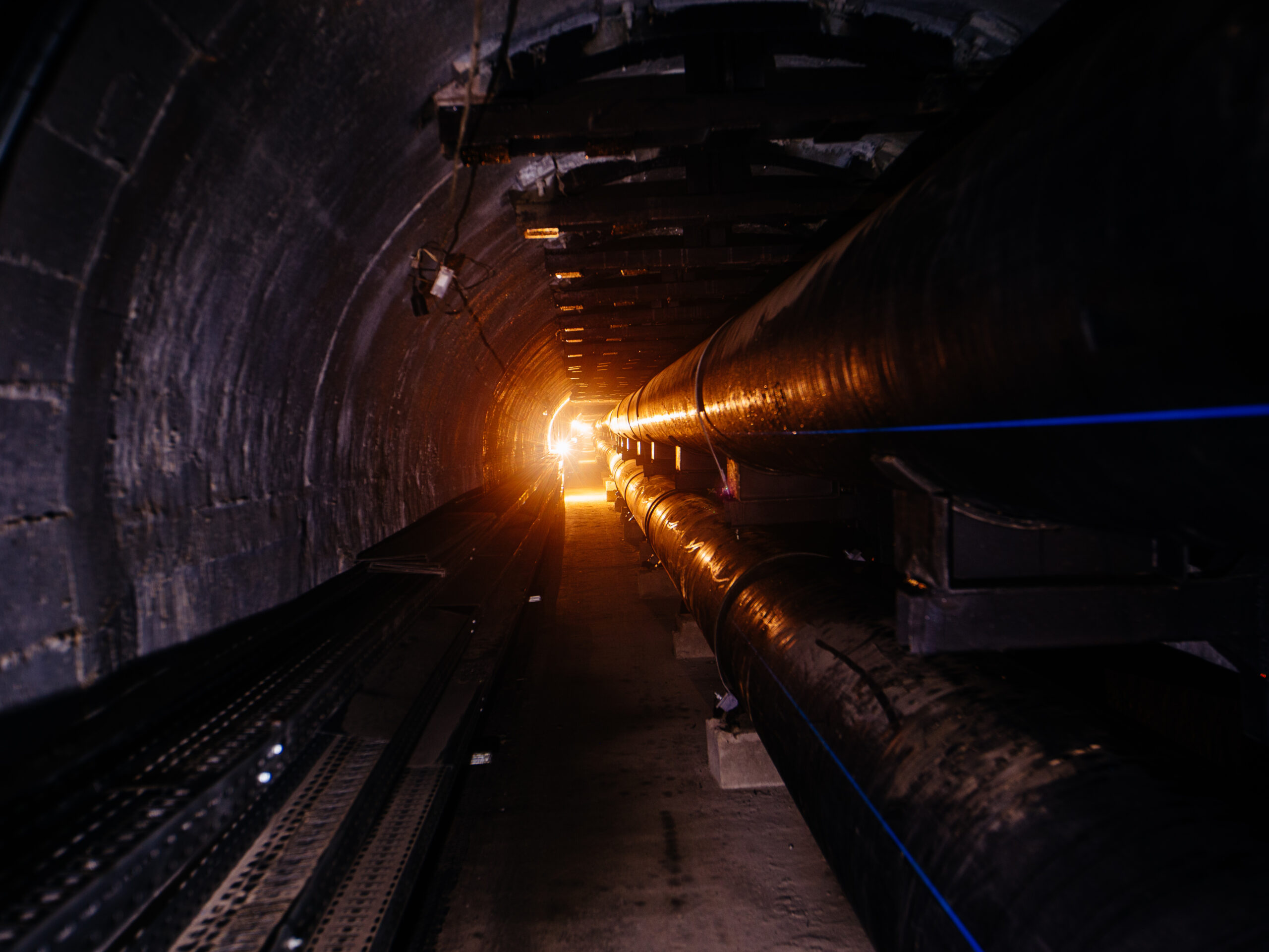
While visibly distinct, these two front-facing designs would not remain physically separate. All of the museum board members felt it was inherently necessary to connect them in some way. As a result, the museum’s expansion would include an underground passage beneath Sherbrooke Street to accomplish that connection.
It would all work to create a striking mix of past and present architecture. Visitors would experience an airy, contemporary environment while still getting to enjoy the heritage style of the old Sherbrooke building.
The Entire Project Would First, However, Require Unique Waterproofing
Even with an approved plan in place, this Moshe Safdie design would not come without some construction challenges. That was especially true when it came to the concrete waterproofing.
To start, the project team needed to integrate the façade walls with the newer ones. Getting that to happen required a form of excavation that would make the walls that needed waterproofing inaccessible from the outside. So it would be impossible to apply a conventional membrane solution.
It would also make the next concrete waterproofing challenge a much bigger concern. After all, the project team would be constructing over a street with multiple main aqueduct and sewer pipes underneath it. So it would naturally have a higher risk of water ingress, which could not only damage the expansion’s structural integrity but also damage any priceless pieces of art found inside.
What’s more, this project would not be cheap as it was worth about $53 million.
That made it all the more crucial for the team in charge of constructing it to find a unique solution that could overcome concerns that a conventional membrane could not.
It Didn’t Take Long to See That KIM Would Be the Answer
Knowing that the expansion direly needed waterproofing but couldn’t make use of the typical membrane systems of that time, Safdie and the other project architects sought a new solution. To that end, they consulted three engineering firms: Martineau Vallee Regimbald, Gascon Vigneault Dumais, and Dionne Olechnowiez.
After taking time to conduct research on the matter, each engineering firm recommended the use of a relatively new technology at the time: the waterproofing admixture KIM.
Despite its newness, KIM had already shown that it could successfully waterproof high-risk projects, such as the Boeing Everett Factory. And it made use of technology that did not have any of the limitations of membranes. Its application was simple, requiring no time-consuming and costly complex steps or intensive supervision. It couldn’t be torn in any way. It didn’t make use of volatile organic compounds either unlike certain types of membranes. And it would continue to work for the life span of the concrete.
Most importantly, however, KIM did not have spatial requirements for application. Instead, the project team could just add KIM directly to the concrete mix. That would transform the concrete into its own waterproof barrier. As a result, the technology within the concrete would be able to react chemically to any incoming water. This process would consume the water and any nearby unhydrated cement particles to create insoluble needle-shaped crystals. These would then interlock to fill up the concrete’s capillary pores and micro-cracks, preventing future water ingress and any contaminants within from passing through.
It’s a process that was proven to last for the life of a concrete structure whether under hydrostatic pressure or not, growing stronger over time.
All of it made KIM the perfect solution for the museum’s expansion. After all, the walls would get the necessary watertight protection they needed. And the project team would get a permanent, unbreakable solution that would be easy to apply, expediting the whole waterproofing process and reducing its cost.
That Led to a Confident Team and a Watertight Moshe Safdie Design
Between the engineering recommendations for KIM and the realization that it could actually provide a better concrete waterproofing experience, the project team went ahead with KIM as their choice. Confident in its success, they had Lafarge add KIM to the concrete mix.
It didn’t take them long to see that KIM had engineering recommendations for a reason. The finished expansion remained not only a visual icon but a watertight one. In the end, the director of Lafarge’s La Haute-Yamaska territory noted that “the results in all applications were simply excellent.”


